Information for Astronomers
User Tools
Sidebar
Table of Contents
Online plotter
The new online plotter provides an easy-to-use interface, and in fact is not only an online plotter but allows you to preview your data offline as well. To start it, simply type
onlplot
into a console on the observer2 (user: "obseff", in the VNC you can also use it directly). We have created a vnc server on
observer2:25
to start the online plotter. Password is the same as for the observing vnc's. There is a menu item to start
OnlPlot2
, or you can use a console inside this vnc. After starting, the main screen looks like shown in Fig. 1.

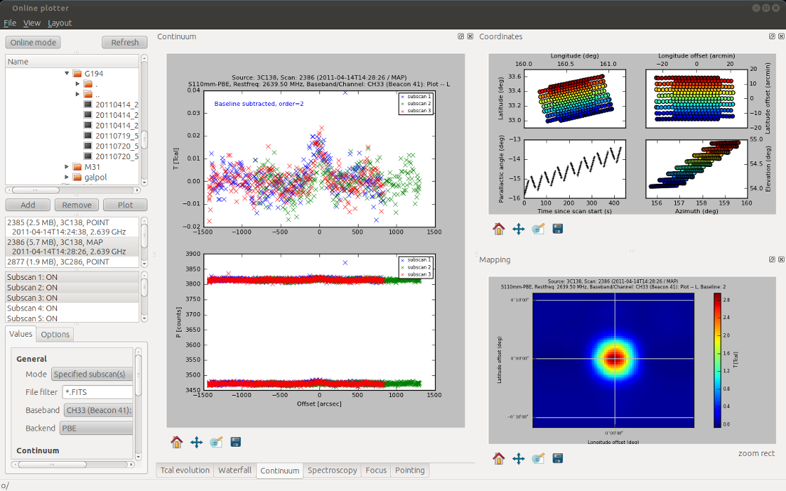
Fig. 1: Online plotter main window after program start. All plotting windows are implemented as so-called dock widgets, which can be re-arranged easily (right panel). Layouts can be stored for fast switching between them.
Loading files
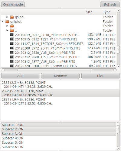
In the left panel (see Fig. 2a) one can choose the data to plot, i.e., add a FITS-file from the file browser (tree-view) in the top to the list of active files in the middle (using the Add button. Each file added to list will be parsed for generic information (scan number, source, observation type, date/time, and frequency). With the Remove button one can remove files from the active-file list. You can have an arbitrary number of active files but a smaller list helps to keep an overview.
Selecting a file in the active-file list will scan the file for the number of subscans. Using the Plot button you can display data and auxiliary information.
Options
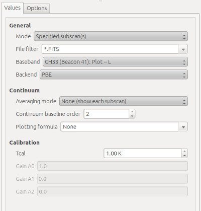
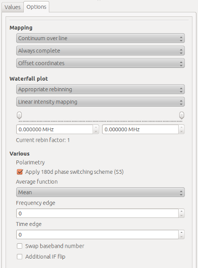
Note, that per default all subscans are plotted/processed. For larger data sets this can be time-consuming. Therefore we recommend to choose the Specified subscan(s) option from the Mode Combo-box (in Values→General) in such cases. Then only the selected subscans will be processed (though coordinates are always shown completely, and the preview map has an additional combo-box, see below). All available options are shown in Fig. 2b.
Continuum data
In Fig. 1 you could already see a typical pointing measurement. Usually four subscans are done, two in longitude and two in latitude. Online plotter shows them in two sub-plots and tries to fit a Gaussian to the data. Fitting results are shown in the upper left part of each figure.
Sometimes weak sources do not show-up well in a single subscan. If you choose the Average subscans option from the Averaging mode Combo-box (Values→Continuum) all subscans are resampled to a common grid and averaged, see Fig. 3.
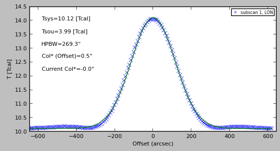
Fig. 3: Averaging/resampling pointing scans.
It is of course also possible to plot a different channel (aka baseband) than the usual plotting channel (Fig. 4). Just choose one from the Baseband Combo-box. In case more than one backend was used, you can also choose the backend of interest from the Backend Combo-Box. The online plotter also enables you to work with (simple) plotting formulae, similar to the old OnlPlot or Toolbox software. The syntax is the same as in the latter, e.g.
| Formula | Description |
|---|---|
| c[33]-c[34] | Subtract channel 34 (R) from 33 (L). |
| sqrt(c[33]) | Plot square root of channel 33. |
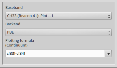
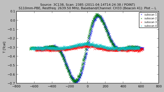
Fig. 4: Left panel: choose channel (aka baseband), backend, and optionally a plotting formula. Right panel: Example continuum plot for the formula c[33]-c[34] which computes L-R.
A very nice feature is the map preview of the new online plotter. For continuum observations it will always grid the reduced data. For spectroscopy one has to define a spectral interval first (see below). In Fig. 5 the computed map for the above pointing scan is shown.
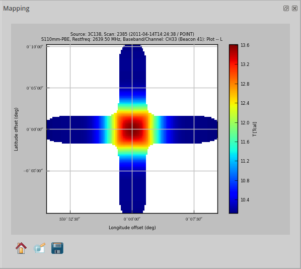
Fig. 5: Map preview for a pointing measurement.
Since a pointing is not really a map, but only a cross, there is of course not much to be gained. In Fig. 6 we show a true continuum map of the source M31 (3.6-cm). Unfortunately, there was a lot of RFI present. To obtain a useful preview, one can just omit bad subscans: choose the subscans you want to plot, use the Specified subscan(s) mode and in the Options tab change the Mapping combo-box to Only specified subscan(s). The result is shown in the right panel of Fig. 6. One drawback of the subscan selection is, that you have to plot all desired subscans in the Continuum view as well, which somewhat slows down the software.
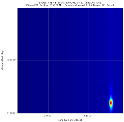
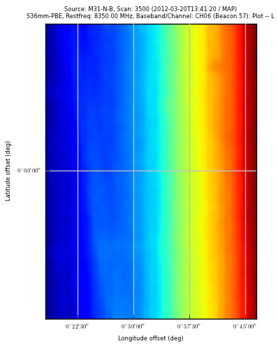
Fig. 6: Continuum map. Due to RFI and air-mass effects there is not much visible.
As you see in Fig. 6 (right panel), although the glitch is gone, there is still not much visible since the system temperature changed substantially during the observation (due to the elevation-dependent air mass). However, you can (and should) subtract a baseline from each subscan. Simply click once into the continuum plot (this is necessary otherwise the matplotlib-based widget won't obtain the following key-stroke) and type in any number between 0 and 9. This will re-plot the data but with a baseline of the requested order subtracted. For our example a 2 was typed in to have a second-order polynomial baseline. The result is visible in Fig. 7. Although there is some residual RFI one can now see clearly a continuum point source and half of the ring of M31.
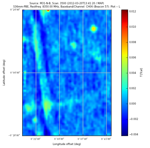
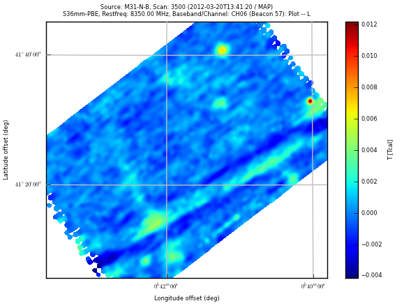
Fig. 7: Map of M31 at 3.6-cm after baseline subtraction. The right panel shows the same data but in sky coordinates while the top panel uses offset coordinates.
Spectroscopy
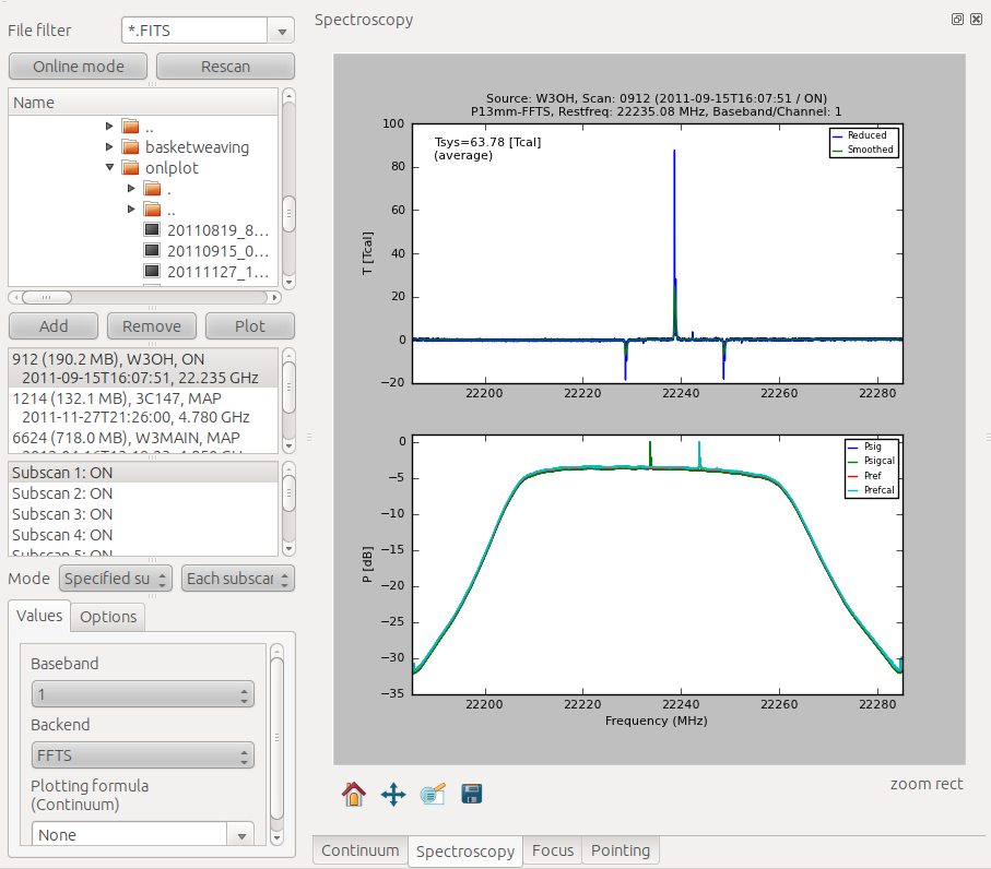
For spectroscopic measurements almost all features work in a similar way as for continuum. If you plot one or several subscans the bottom panel will show the raw data (log-scale) the upper panel the "reduced" data (using the same algorithms as the class pipeline), see Fig. 8.
To produce maps, the user has to define a spectral interval first. Just click into the spectrum and press 'w' to set a window (indicated by green lines). With 'c' you can clear the window. When a window is set and the user clicks the Plot button a map is generated, or strictly speaking two maps: the first shows the line as color image, the second is overplotted as contours and visualizes the continuum. Numerically, the average of the flux outside the window, i.e. in the adjacent 200 spectral channels, is used as a proxy for continuum. The average of the flux inside the window minus this continuum defines the line map. Therefor, values in the map are Intensities in units of Tcal per channel (not per Hz or km/s!). All maps are also written as a fits-image into /tmp. Don't forget to copy the image file to your home directory if you want to keep it. (The Karma software is installed on observer2 and can be used to display the fits maps.) An example is shown in Figs. 9 and 10.
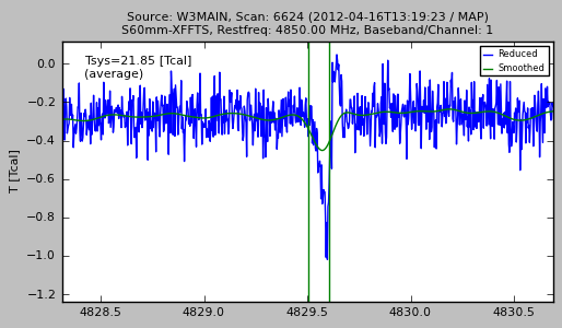
Fig. 9: Defining a spectral interval.
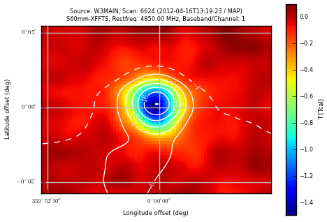
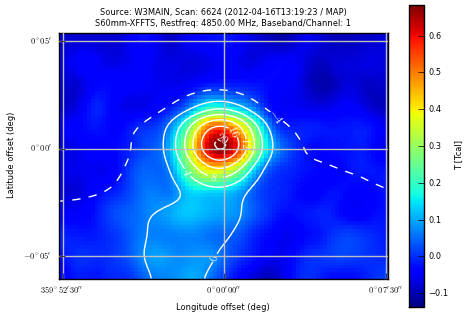
Fig. 10: The maps show an absorption line (H2CO) and the H110a RRL in W3Main. Contours visualize the continuum flux.
Coordinates
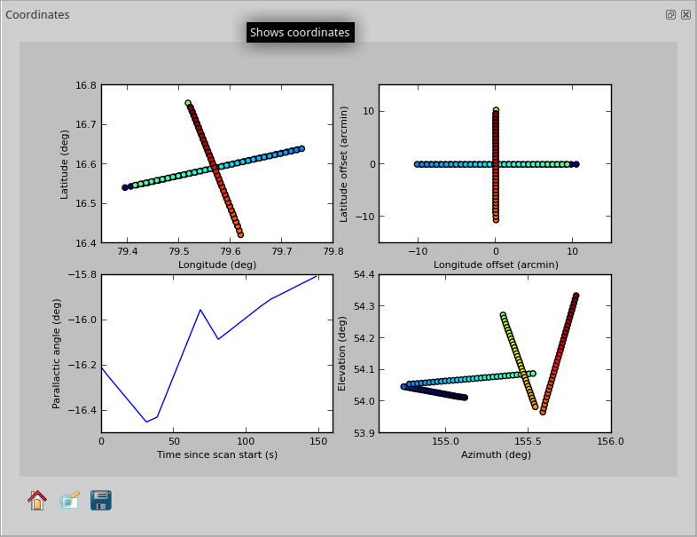
Another useful feature is to visualize coordinates. Four different plots are provided, showing Azimuth-Elevation, Offsets in the basis frame and the absolute coordinates in the basis frame. Furthermore, the P.A. is plotted vs. time. See Fig. 11 for an example.
Online mode
If you click the Online button, the online plotter will continuously show the last file (and last subscans). To avoid extreme processing times, only the last 4 subscans are displayed - except for the preview map where either the full map is displayed or selected subscans, according to the choice in the Options tab (see above). If you work with very large files, it is recommended to not show the complete map in online mode.
Suchindex / alternative Suchbegriffe für diese Seite:


onlineplotter online-plotter onlplot

